Mid May Covidmeter findings:
- Lock down does not prevent Covid-19 spread
- China reporting standards are different than other countries. You can call it cheating if you like. It is just a tag, however Chinese propaganda will not like it
- Covid-19 deaths toll scary in absolute numbers pales compared with population size
- Both common cold and Covid-19 are here to stay, they will not take us all from here to eternity, just some individuals
World summary
Table below shows key numbers on Covid-19 development. ECDC data sets provide information on cases and deaths, so we can find some top scores. Metric come in some variations, they can be combined:
- Suffix 1M – per 1 million inhabitants data.
- Suffix 7d MA – 7 days moving average
- Prefix population > – values calculated for countries above population threshold.
| date | country | value | population | |
|---|---|---|---|---|
| max cumulative cases | 2020-05-14 | United States of America | 1390746 | 327167434 |
| max cumulative deaths | 2020-05-14 | United States of America | 84133 | 327167434 |
| max cumulative cases 1M | 2020-05-14 | San Marino | 19032 | 33785 |
| max cumulative deaths 1M | 2020-04-27 | San Marino | 1213 | 33785 |
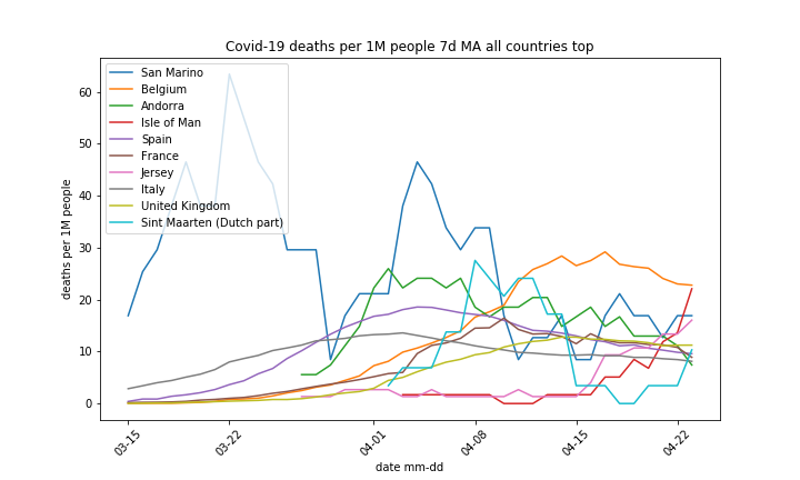
| max daily deaths 1M 7d MA | 2020-03-22 | San Marino | 63 | 33785 |
| population > 100000, max cumulative cases 1M | 2020-05-14 | Qatar | 9540 | 2781677 |
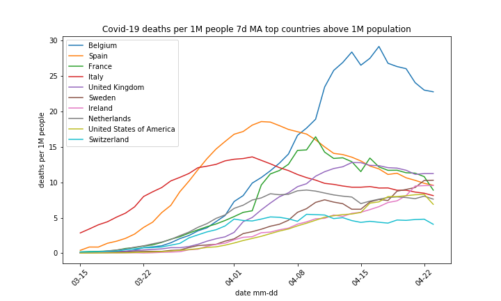
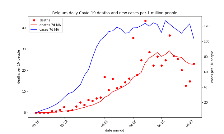
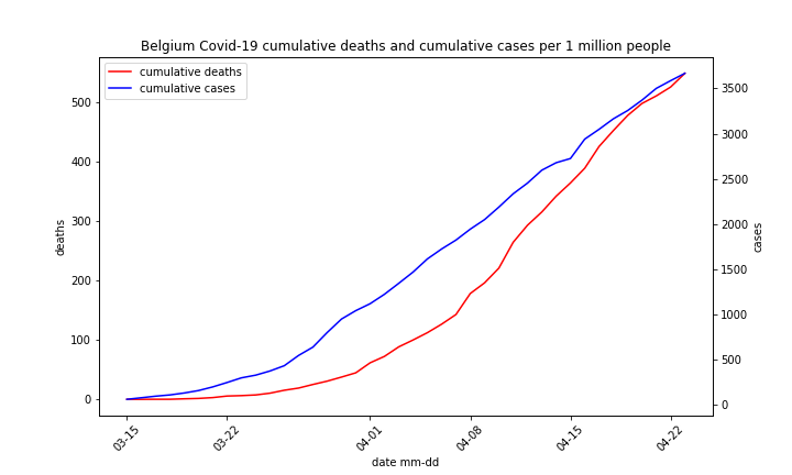
| population > 100000, max cumulative deaths 1M | 2020-05-14 | Belgium | 774 | 11422068 |
| population > 100000, max daily deaths 1M 7d MA | 2020-04-17 | Belgium | 29 | 11422068 |
| population > 100000, max daily deaths 1M | 2020-04-26 | Ireland | 48 | 4853506 |
| worldldwide Covid1-19 cases | 2020-05-14 | 4309508 | 7547997301 | |
| worldldwide Covid1-19 deaths | 2020-05-14 | 298673 | 7547997301 |
- USA leads in absolute numbers, it has big population but China one is even bigger and pandemic started there. China either quenched Covid-19 or implemented creative reporting, the former is easier.
- In San Marino nobody died due to Covid-19 since 27th April and they report cases on daily basis. There is a good chance the virus penetrated entire population, killed 0.12%, This hardly qualifies as carnage.
- Daily deaths maximum straight number (Ireland) and moving average (Belgium) were scored back in April
- Absolute number of deaths is impressive but it represents around 1% of all deaths on Earth in Feb – mid May time frame. Human population is huge, we are mortal, 7.5 billion population produces in average over 200 thousands deaths per day.
Top countries
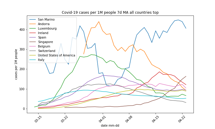
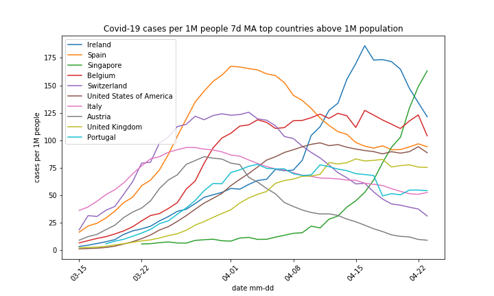
Figures below show top 30 countries selected by cumulative number of cases. The group represents 90% of total cases and 95% of total deaths.
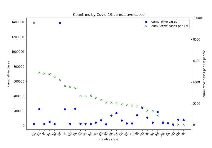
- Countries are sorted by cumulative cases per 1 million people
- China (CN) is unique in its ability to stop Covid-19. No other country poor nor rich small nor big was able to repeat its success. China culture is not about social distancing. Is superb quarantine or rather creative reporting behind China success?
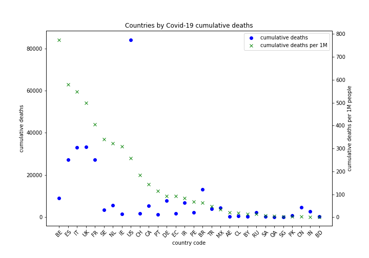
- Countries are sorted by cumulative deaths per 1 million people
- Again China is at the end. Normally country first hit by epidemic will suffer most, others can learn from its experience and prepare a better response. Maybe they are stubborn to learn and inept to implement solutions instantly developed in China?
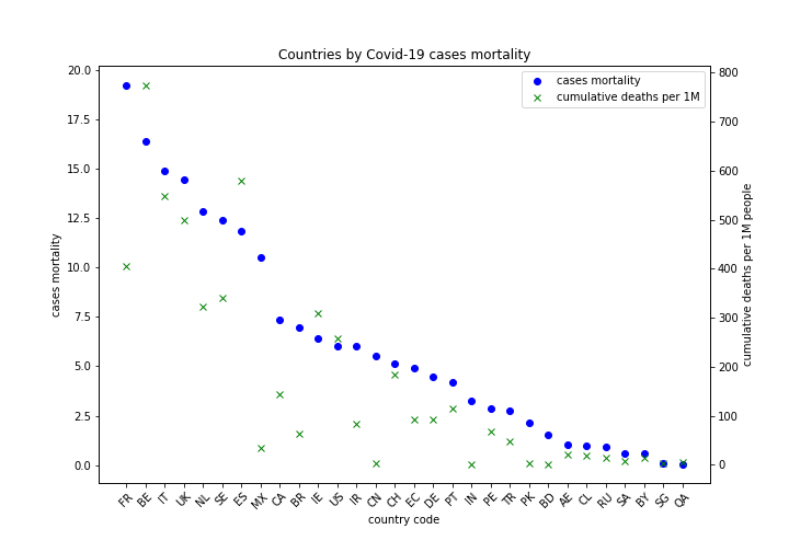
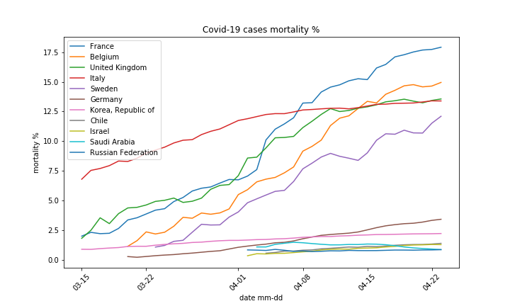
- Countries are sorted by cases mortality
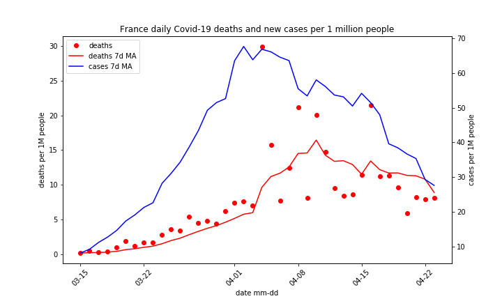
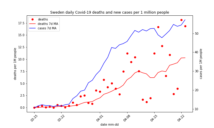
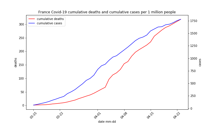
- Please note wide range of cases mortality rate, from 1% Russia to 20% France. This indicates wide difference in both death and case definition.
Covid-19 cases and deaths evolution
Figure below compare recent and reference values. We show Covid-19 cases and deaths. Countries are selected in the following way:
- Dashed lines represent reference countries, we are looking for historical maximum in the following categories:
- cumulative cases (cc),
- cumulative cases per 1 million people (cc_1M),
- cases per 1 million people 7 days moving average (cma_1M)
- Solid lines represent 3 countries with top recent cma_1M.
- Country once selected is excluded from subsequent selections.
Rule for death comparison is similar to cases one.
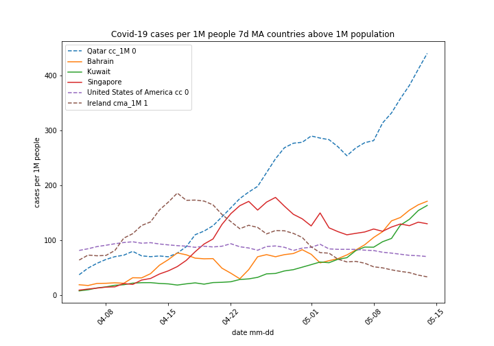
- Quatar reports 4 times more cases per million people than next country in this category, while its death toll is low (see earlier charts). We see historical maximum in cumulative cases per million and cases per million moving average now, so Quatar line is dashed. This can be explained either by superb testing coverage or long lag between infection (case) and death. Please note cases surge took place in April. Lock down measures did not help to prevent it.
- Singapore (SG) was in lock down, observed social distancing, is geographically isolated, has strong somewhat authoritarian government. Yet it experienced Covid-19 outbreak in April. It seems no one but China can implement lock down properly.
- Quatar, Bahrain and Kuwait are top 3 in recently detected cases. Persian Gulf is Covid-19 hot spot, again lock down does not prevent Covid-19 spread.
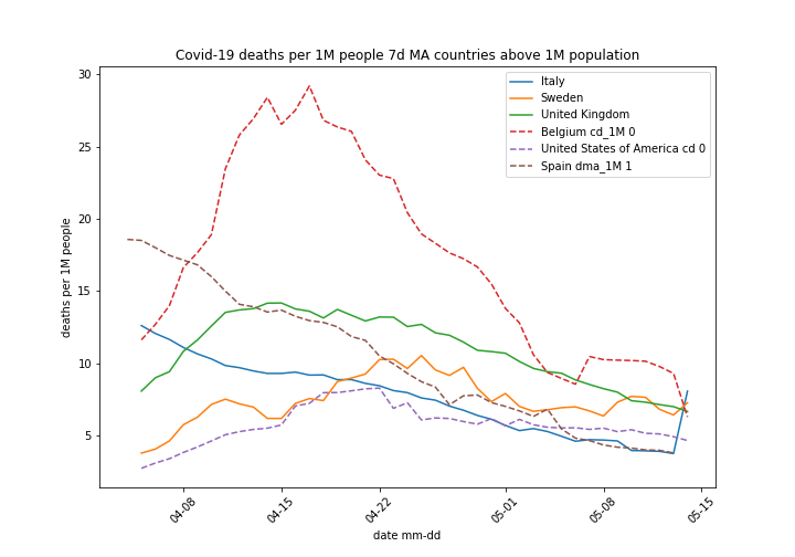
- Deaths per 1 million people are dropping
- In Italy we see a jump of daily deaths. Covid-19 takes long time to incubate and produce fatality, so it may be not directly related to lock down easing. Increased figure is still low comparing to historical values.
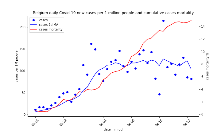
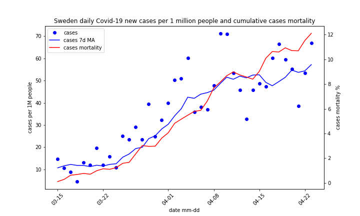
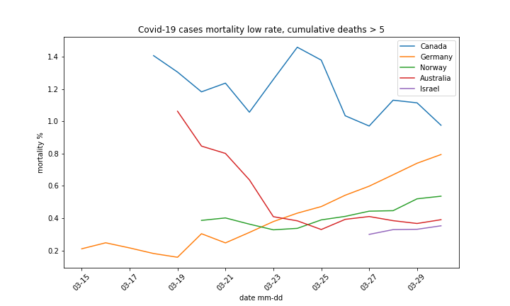
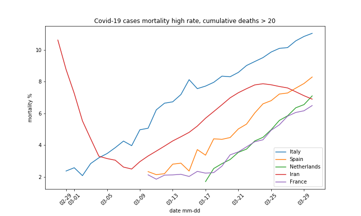
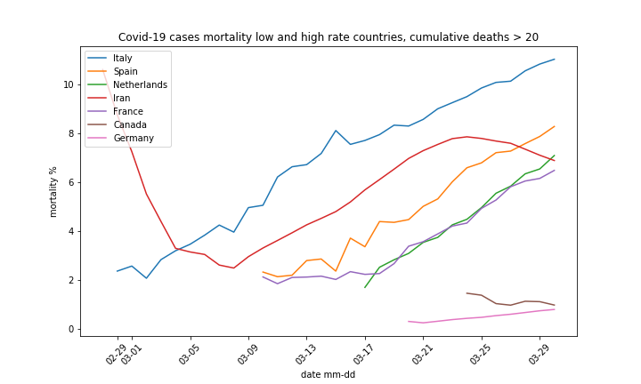
Cases mortality comparison
We calculate cases mortality dividing cumulative deaths by cumulative cases. High and low cases mortality countries are selected in the following way:
- More than 20 cumulative deaths and 10000 cumulative cases
- Sort by cases mortality rate
- Take top 5 and bottom 5 from above list
- Add Germany to result
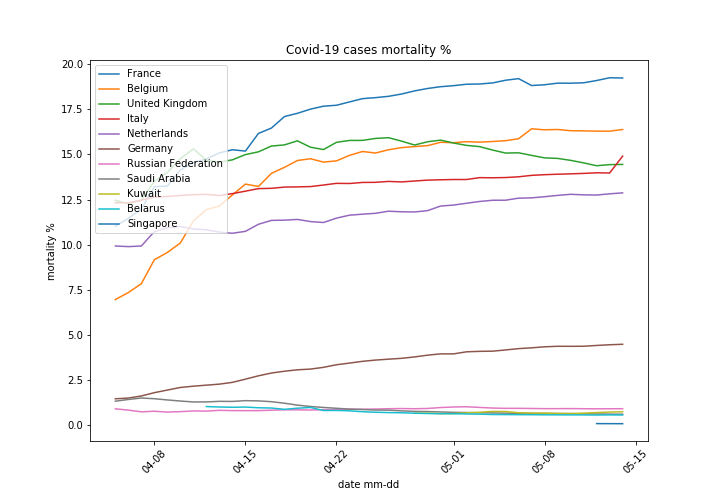
- Top mortality countries is stable
- Mortality rate in UK drops, this may be due to increased testing capacity or Covid-19 true cases peak – everybody prone to virus already infected.
Chart below shows countries with lowest mortality rate.
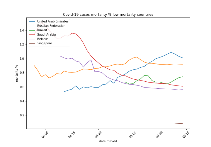
- Russia has very high number of cases, above 110 thousands, this is order of magnitude higher than other countries on chart. Interesting is mortality rate for Russia stays constant. For other countries it went up once number of cases soared.
- SIngapore has over 20 thousands cases and very low mortality rate, total deaths as of 14.05 are 21.
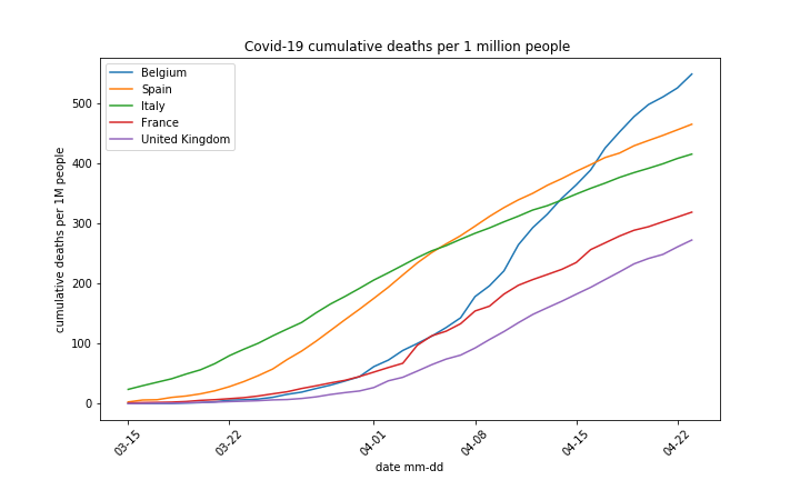
Cumulative deaths per 1 million people
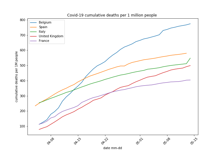
- Leaders group is constant
- Italy shows increase, too early to declare it a trend
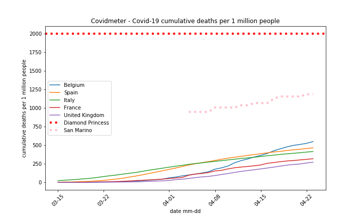
Covidmeter
Covidmeter compares cumulative deaths per million people for top countries with reference. Reference countries are:
- Diamond Princess cruise ship
- San Marino – country, enclave in Italy
DP development is closed, crew and passengers disembarked the ship. San Marino is a live group, the country has tiny population, over 30 thousands, but it was hard hit my Covid-19.
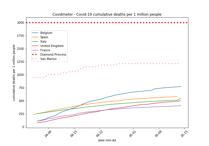
- No country came close to Diamond Princess death toll declared limit at the beginning of April
- San Marino still reports Covid-19 cases on daily basis, last death was reported 27th April. Neither Covid-19 nor common cold will be fully eliminated there.